Sunday, 7 November 2010

And there it is...

So there we have it my six degrees of separation between Antoine et Manuel to Emigre.


A+M link to Stefan G. Bucher through the style and subjects of their illustrations,


Stefan G. Bucher wrote about Hideki Nakajima in his book All Access,


Nakajima has produced work as a homage to Peter Saville's work,


Peter Saville famously used Wim Crouwel's New Alphabet on his Joy Division cover,


Wim Crouwel took in Rudy Vanderlans on a two year apprenticeship in 1979.

Emigre


The brainchild of Dutch typographer Rudy Vanderlans and his wife Zuzana Licko who set up the collective in the early 80’s with the focus of presenting young and up coming designers who weren’t getting the recognition that they deserved.

The pair throughout the years have studied at various schools and under various high profile designer throughout their careers such as Wim Crouwel, and have designed many exciting and unusual typefaces as well as presentable and usable everyday font’s such as Mr and Mrs Eaves a family of San serif and serif typefaces to a large collection of picture fonts such as Blockhead and Big Cheese.

However they are best known for the magazine Émigré which ran for twenty years over a bi-quarterly (sometimes) format. The magazine showcased younger artists as well as including essays from high profile designers such as Rick Poyner, although it was the layout of the magazine which brought in the readers.
It followed a very grunge like feel lot’s of what appears like montage which is also repeated throughout the layout of the text, which at the time was very unusual and completely different to everything else available in the same category. The fact that the publication was more experimental than other also meant it could take risks and this would be shown through Vanderlans choice in some unusual subjects of the 69 issues of the magazine. Maybe this reflects why some issues of the magazine were some times easier to find in a record store than on the shelves at a newsagents.
Over the years the magazine changed format several times each time the design being used to promote the magazine to a different audience, offering for certain issues a smaller pocket sized book which was easier for reading on the move. It was these changes and through the growth of the magazine that it got it’s name as a serious piece which covered everything under the title of graphic design.

Wim Crouwel


Wim Crouwel or Mr. Gridnik to his friends, a name derived from the designers love of grids and the influential part they play throughout his work, is a Dutch graphics designer and typographer who is probably best known for his controversial typeface New Alphabet, although he has also created other outstanding pieces of work throughout his career.

Such as, vorm gevers originally designed by hand in 1968 this typeface shows just how much Crouwel enjoyed using grids to layout all aspects of his designs, including in this case the exact design of his font.

It’s this use of grids which is visible through his type designs, with new alphabet it was more through the function of this piece, as originally it had been designed to work best on a Cathode Ray Tube which were being used on early monitors, and at the time was only able to produce on horizontal and vertical lines. The typeface lacked visually as many of the characters were not legible if the reader didn’t have previous knowledge of the font.

However it was in 1988 when Peter Saville used this font to suggest a different meaning and it is the connection to modernity which makes this timeless font work throughout different styles even though the character still lack legibility they work well to convey as message.

Crouwel has also had many of his classic typefaces adapted and turned into to modern digital fonts, one of my favourite of these is his Gridnik font with which the designer shares his nickname. The font works with what early computers could show as it is an adaption of Olivetti Politene an older typewriter font, you can see how he has changed the angles to make the font work for the screen however this has produced certain lines which appear almost glitches on the screen however keeping it legibility throughout.

Crouwel has had an influence on many designers over the last fifty years taking in many students on apprentices and follow up work, however in 1979 he took in one young student Rudy Vanderlans.

Peter Saville

Best known for his work with Factory Records and the Hacienda Saville’s timeless works have been referred to for generations and will continue to be used as examples of great work.

The bright colours used within the Hacienda come straight from Saville’s mind as he was trying to create a room which connected to the music which was originally played there whilst trying to keep a connection to the brand he had created for the record company and it works well at doing both of these. Unfortunately I am too young to have visited this iconic club and am envious of those who had, the photo’s which can be seen of the interior do not do justice to the designs that are plastered, painted and hanging within.

He uses many different techniques when creating his work, using cut and stick techniques to draft artwork, however he does enjoy having contributing designers work with him to give him fresh views on where a piece can go.

His work for Joy Division has probably given him more limelight than any others with the iconic design now being used on everything from T-shirts to skateboards. It was also a good representation of how digital techniques could be used to recreate one image in various forms.

More recently Saville has completed a design for the new England Football shirt which although I can see his angle I feel that it is not well completed and doesn’t really connected with the target audience with the small multicoloured crosses appearing too ‘girly’ for the fan base of the countries team.

However his design for the Substance cover using Wim Crouwel’s New Alphabet set in bright green on a black background also stands out of one of his most prolific designs yet.

Hideki Nakajima


Which has lead me to this Japanese designer, as his work is published in the previously mentioned book by Bucher, his style varies from piece to piece although you can see reoccurring themes and techniques such as his love for typography and mixing it with photographical elements.

During his career he has had various jobs and some high profile design companies however he didn’t feel like he could express himself through his work at these establishments. This is what lead him to create his typographies, a collection of personal work which displays various form of typographic material from 3D letters photographed for magazines to hand drawn letter forms.

One aspect I did find interesting about this designer is his refusal to use computers he will design for this form of media however his artworks will be finalised by someone else, a strange way of working in what is becoming a very digital world.

This following piece is for a Japanese artist Ryuichi Sakamoto, for which he has completed various sleeve designs and it is here you can see his homage to one of the designers which first got him interested in the industry…

Stefan G. Bucher


Stefan G. Bucher works as a graphic designer, illustrator and writer, and his style does vary between the formats he is creating. Now based in California with his one-man-band company 344 the German designer has a very playful style to his illustrations, using colourful character design creates one of his best known pieces, his blog Daily Monster. I saw this as a clear connection to the works of A+M as he also creates these ‘Monsters’ through his own visions of what the world could be.

I find his technique for drawing these creatures interesting as rather than envisioning the idea and trying to get it onto paper he uses ink blot splatters to form the basis of each character and then links the elements together to create a final ‘Monster’ for that day. This holds many benefits as it enables him to come up with designs that never look the same through the random creation but then also the keep continuity as certain aspects of the blots show through on the final piece.

Another aspect which is repeated through his work is his love for hand drawn circles, he uses them to border images add depth to his typographic designs and also as the basis for some aspect of his character design, I feel that this simply represents further the playfulness and childlike aspect of his illustration work, keeping it simple works.
One good example of his playful work is the cover to the Bumper Summer Fun Issue of Creative Review the idea that the cover can be interacted with the show the flat images surfing on a summery day.

He has also written many books on design but one of my favourites is All Access: The Making of Thirty Extraordinary Graphic Designers which focuses on the way that design has changed the personal life of some the worlds most prolific designers and also how their lives have changed the way that they design.

Sunday, 31 October 2010

Antoine et Manuel

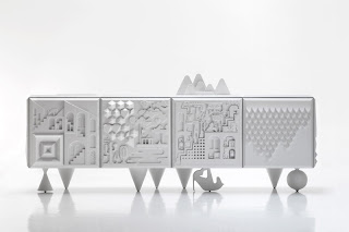
Antoine et Manuel are a duo who work from France producing graphic and illustrative products, spending the early days of their partnership creating invitations and other graphic material for Christian Laerios. They have also more recently moved into product design creating the first mass produced piece of furniture ‘Cabinet Tout va Bien’ for the Spanish company BD Barcelona.I think the best way to describe Antoine et Manuel’s work is playful with a large range of colours and a strong mix of illustrative vector graphics, their personalities really show throughout the portfolio, creating pieces which other designers would be too scared to do.

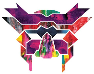
My favourite aspect of the work and somewhat of a recurring technique used is the mixture of paint with clean vector graphics, which can be seen at full stretch on their work for AOL, they add texture to what would otherwise be clean cut shapes. The style of their painting also suggests their colourful, and sometimes dark, personas with other pieces having visual connections to the ink blot imagery best known for their use in psychiatry.

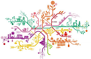
Within their work they don’t just create great imagery but they create this whole mythological world full of their own crazy dreams I feel this is good because they encourage the viewer to create their own world somewhere where they feel at peace in their own imagination A+M just choose to put theirs down on paper or plastic in the case of the Cabinet.